Bruce Price in Context
Dean Sobel
Today one is told that abstraction can still surprise us, that its history is still before it, that it is still a live question…. But this means that [abstraction] must be rethought, breaking loose from conceptions that have long framed its discussion.
-John Rajchman, Constructions, 1998 1
[The rejection of Abstract Expressionism in the 1960s and 70s] left us with a very nice plot of foreclosed real estate that . . . younger artists could make use of—especially those who were supposedly barred from the place to begin with.
—Amy Sillman, “AbEx and Disco Balls,” 2011 2
In a series of essays compiled in the late 1990s intended to address contemporary art and architecture, John Rajchman made a case for abstraction, which at that time was widely considered to be at its nadir.
By the end of the twentieth century, abstraction, modernism’s defining characteristic and proudest achievement, was of little interest to America’s most celebrated artists—ranging from Matthew Barney and Janine Antoni (rooted in performance and the body) to Glenn Ligon and Kara Walker (mining “post-Black” identity) to John Currin and Lisa Yuskavage (wacky figuration). Instead, each developed cogent, mostly representational forms of artmaking to express their ideas and feelings surrounding personal and cultural identity. Famously, the Whitney Museum’s 1993 Biennial Exhibition, purported to be a barometer of contemporary American art, included virtually no abstract art. This was, of course, not the first time in post-War American art when more-or-less representational forms—figurative painting and sculpture, installations of objects from the environment, body art, and film and video—advanced in compelling ways while painting and, especially, abstract painting, held steady.3
Rajchaman keenly understood that if artists wanted to re-engage with abstract painting, the problem was not simply the narrow, flattened space into which modernist abstraction had been squeezed by the critical minds of Clement Greenberg, Michael Fried, and others. By this point, formalism had long been rendered moot and it was also no longer a question of simple “opposition to figure or image,” particularly after the “pictures generation” artists routinely appropriated modern abstraction’s beloved styles. Even earlier, figures like Robert Rauschenberg and Jasper Johns realized that, in the immediate post-abstract expressionist period, modernist abstraction—from Malevich to Pollock—was just another reproducible image and, increasingly, the symbol of a by-gone era.4 In this context, the adherence to the idea of the canvas as a tabula rasa, the mythic blank slate waiting to be marked, was ridiculous—a blank canvas inhabited the entire history of its medium.
Abstraction could be “conceptual” (what art isn’t?) and have the capacity to describe, depict, or express almost anything, including these more recent concerns of identity, difference, and a host of systems and structures that embody our human experience. Rajchman wrote,
“one must come to see the surface not so much as empty or blank but rather as intense—one must be blind enough to see the surface as … transformable and deformable.”5
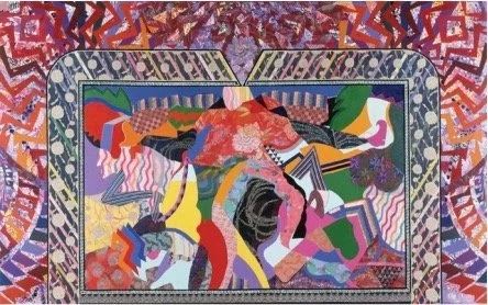
Given the possibilities of an enlivened painting surface, abstraction has returned to be a rigorous workspace for the past 30 years, as artists scoured the fading breaths of modernism. Movements and artists that had been routinely marginalized by historical abstraction (women, artists of color, and queer artists) were especially open to abstraction while new generations of curators and art historians re-examined pre- and post-War art through a post-colonial, global lens.6 Artists and curators mined the fringes of American art from the 1960s and 70s for nourishment, elevating and celebrating things like decoration, the so-called craft media, queer politics, regional difference, and, especially, things that were considered fey, gay, light, or lyrical (which, by the way, are values and interests for Bruce Price). A movement like Pattern and Decoration, from the mid-seventies, never really achieved the critical unanimity that it probably sought when painters like Miriam Schapiro, Robert Kushner, and Robert Zakanitch, armed with a fondness for debased artforms like patterned textiles, created mural-sized tapestry-like wall hangings that were a complete affront to the heroics of Abstract Expressionism and Minimalism (Schapiro called hers femmages).7
Other degraded artforms, such as those made through clay, glass, basketry, weaving, embroidery, and commercial and industrial fibers, started to be considered alongside abstract expressionism, post-minimalism, anti-form and process-centered sculpture, elevating the achievements of figures like Peter Voulkos and Robert Turner, both ceramicists; Lenore Tawney and Sheila Hicks, who worked in large-scale fiber media;, and Therman Statom and Melvin Edwards, black artists who employed, respectively, cast glass and barbed wire in stinging artworks that were reflective of their experiences with racism and class. In 1979, these media got their own full-scale New York museum, for better or worse, the American Craft Museum (now the Museum of Art and Design).
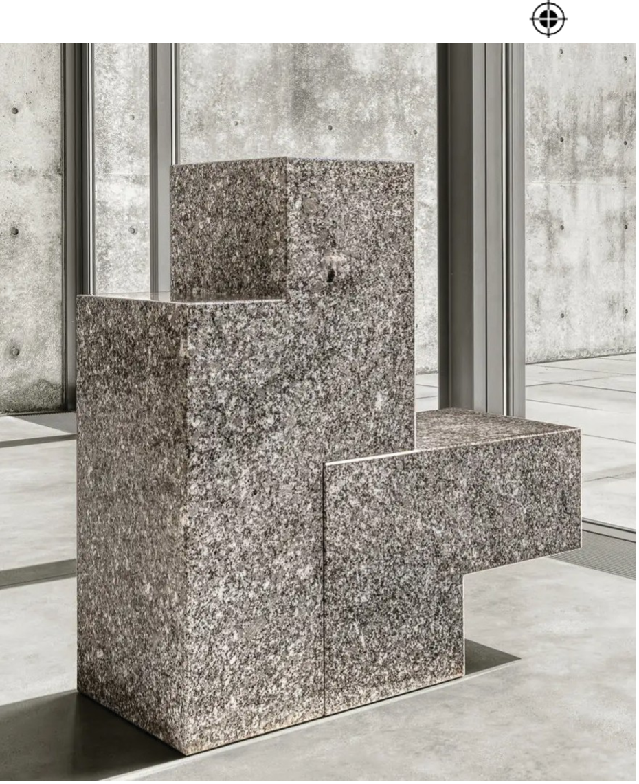
Around this time, Robert Mapplethorpe, Harmony Hammond, Scott Burton, and many others regularly expressed same-sex desire (and their sexual fantasies) in various ways, often with a keen fascination for transgression. Burton’s unassuming performances and especially his minimalist public works, fashioned in the form of high-concept design, routinely expressed queer activities, probably to the surprise of the real estate developers and museum patrons who acquired them (see, for example, Burton’s particularly transgressive Two-Part Chair, 1987, highly suggestive of a couple engaging in anal sex).8
Transgression and abjection was already apparent in the body-based performance activities of Carolee Schneemann, Vito Acconci, and Paul McCarthy and, in the next generation (Price’s), in the drawings, paintings, performances, and sculptures of Mike Kelly, Kiki Smith, Robert Gober, Ron Athey, and Kara Walker. All these artists were living through the ravages of AIDS (and our government’s indifference), and routinely presented dismembered body parts and bodily fluids and processes. Painting was also subject to various transgressions, for example, Christopher Wool’s use of rollers to layout grisailles wallpaper; Glenn Ligon’s impersonal stenciled technique; Mary Heilmann’s lazy, geometric abstractions; and Philip Taaffe and Lari Pittman’s vinyl collage paintings.
Here, I think, is where Bruce Price’s story begins.
His art runs—in curious and compelling ways—both in and out of the theories and practices laid out in the previous paragraphs. From the outset, Price rooted his practice in the sometimes contradictory issues and themes that surround most artmaking—basic things like color, space, proportion, form, and process, but also deeper investigations into seriality, pattern/ decoration, transgression, difference, queerness, various systems, the indexical, materialism, the distortion of patterns, chance, chaotic ordering, and disjunction, all with his dictum of “abandon anything, at any time, for any reason.” He is, by blessing or curse, protean and prolific. His abstractions run the gamut of types: hard-edge, geometric, optical, gestural, color-field, utopian, splatter and drip, monumental, and diminutive. Like others of his generation, his painting practice freely veers off into other media, both 2- and 3- (and 4-?) dimensional.
Other than early interior and figure studies and one-sided mail art in the 1980s (and, later, a few text works and “porn collages”), Price has been committed to abstraction and all its glorious histories and traditions. He is part of a larger tendency to wrestle abstraction away from the heroics of abstract expressionism and minimalism, while imbuing both with what could be called the personal and the intentional. He has invented, deconstructed, and transgressed systems, patterns, structures, colors, and forms, most obviously detected in his frequent use of modified grids, mis-shapened geometries, and asymmetry. These stand in sharp contrast to modernism’s love for Van Gogh-ian expressionism, Clement Greenberg’s eugenic “purity,” and even the various “appropriated” abstractions common among the so-called post-modernists (the “surrogate abstractions” of Sherrie Levine, Peter Halley, Phillip Taaffe, and Allan McCollum). In fact, Price is closer to the post-Warholian traditions of irony, critical distance, observation, queerness, and detachment.
Born in 1958 in Topeka, Kansas and raised mostly in Indiana, Price, the son of a psychiatrist (his father) and microbiologist (his mother, who died when he was 8), endured a childhood that was probably common to many growing up in the 1960s, when the 1950s confronted the post-Beatles counter-culture. He, like many of us, rarely fit in at school, was on the receiving end of bullying, and gravitated to a small number of friends and interests. Price excelled at the viola and was part of the World Youth Symphony at Michigan’s Interlochen Arts Academy. During his late twenties and early thirties, he lived in Minneapolis and Dallas, pursuing a number of vocations, including a caregiver for AIDS patients. He also thought about art, which resulted in a shift in his creative interests from music performance to the world of fine art.
His earliest works of art, juvenilia in actuality, emerged from an impulse to create something that both challenged him and gave him solace during the Reagan/Bush era. For Price, this meant using a marker to put down dots within the fixed grid arrangements of preprinted graph paper. He also made more complex, representational images of expressive/surrealist interiors (dubbed “doom rooms” by a roommate). A large group of acrylic works done in the late 1980s on 5-by-7 inch panels established him as a painter. They serve as an apt beginning: diminutive, anti-heroic exercises revealing a predisposition for system- and serial-based art. According to the artist, these works were also an attempt to uncover answers to questions like, “What is the look of thinking?,” and “Can a hand mark be both personal and provocative?”9
In 1994, Price moved to Denver. As described by Michael Paglia elsewhere in this publication, early in his time in Denver, Price stumbled on an exhibition of works by Clark Richert at Peyton/Rule Gallery. Richert (1941–2024) was head of the painting program at Denver’s Rocky Mountain College of Art + Design (RMCAD) and, along with several others (he was inherently collaborative), Richert created a remarkable scene during the 1960s in and around Colorado, beginning with the commune-cum-artwork, Drop City. Price was struck by Richert’s system-based, quasi-futuristic, fetishistic breed of abstraction.
Price enrolled at RMCAD that year and obtained his BFA in 1997 (later he was hired to lead RMCAD’s Institute for Experimental Studies).10
Price’s 1998 RMCAD graduate show included what are probably his first “mature” works – a series of medium- and large-scale paintings using Dynamic Symmetry. Initially developed by 19th-century American artist Jay Hambridge, dynamic symmetry involved a system, one of many Price will employ, to organize a composition by breaking it down into compositional zones, sometimes as basic as fore-, middle-, and background. The goal was to activate a viewer’s engagement with the two-dimension picture plane.11 For Price, dynamic symmetry (and similar math-based systems, such as the Golden Section, used by artists for centuries) provided solutions to a persistent question for artists: “how do you arrange a picture?” In nearly every case, Price made studies using basic drawing applications on his computer. Price’s application of this system resulted in what are generally called geometric abstractions, but unlike well-known practitioners both pre-War (Piet Mondrian, Josef Albers) and post-War (Ellsworth Kelly, Leon Polk Smith), Price allowed his surfaces to reveal evocative glazes, human touch, and even chance.
The series expanded, literally, to include deeper, box-form canvases, extending the compositional system onto the work’s edges. From this point forward, Price will allow his art to involve the third dimension, eventually leading to ceramic, wood, paper objects, and installation. Near the end of the series, lozenge shapes began to appear, conceived through the 45-degree bisection of the squares and rectangles that result from his geometric systems. One he titled, The Decorative Transgression of Utopian Geometries, 2001, leaving no doubt about his regard for modernist abstraction.
Lozenge shapes (basically two-dimensional diamonds) were the basis for his next body of work, made between 1999 and 2002. The structure of these new works, such as the queerly titled Rita Descartes and Glamour, both from 1999, announced more vibrant, even uplifting color schemes (a pink lozenge, soured by their medium green background in both works). The flat diamond patterns, which in Rita Descartes includes only the tip of a second lozenge, are now paired with another, entirely different pattern – in this case, columns of alternating red, white, and gray rectangles offset sequentially in their adjacent columns. These Escher-like sequences (one is appropriately dubbed Jiggly Diamonds, 2002 establish his commitment to disrupting any single system or pattern, in this case the nearly imperceptible result when one system (“root 5” [√5]) morphs into the differently proportioned lozenges produced by root 4 (√4). Equally compelling is Everything Happens All the Time, 2001. Though different in appearance, the basic structure is based on distorted grids and the new shapes that can be revealed when this hollowed framework is broken apart. The work’s shifting patterns and random color structure—from a reduced palette on the left column toward the more varied colors in the matrices on the right—reveal that “order,” or at least a single order, has been abandoned.
Next were the Fill paintings, completed in 2003 on 50-by-50 and 68-by-68 inch supports strategically hung at a 45-degree angle. This canvas orientation is aligned with high modernism, particularly through Piet Mondrian and his followers’ lozenge paintings. It’s a small transgression, but one that still feels radical. Each of the Fill paintings confronts us with a plane of diminutive, highly organized painter’s marks arranged in super-tight, variously arranged grids. The works are named after artists and are homages to various modernist figures from the past, i.e., Piet (Mondrian), Franz (Liszt), Ray (Eames). Along with earlier titles, such as Rita Descartes and future titles, such as Who’s Afraid of Marsden Hartley, 2009, and Bridget (Riley), 2025, Price goes beyond tongue-in-cheek reference to his heroes from art history to also begin a dialogue about gender.
The Fill paintings were part of the portfolio that gained his acceptance to Maine College of Art in Portland, where he studied between 2004 and 2006, leaving with an MFA in interdisciplinary studies. He studied with Shirley Kaneda (b. 1951), an abstract painter, and he also came in contact with British artist and theorist Jeremy Gilbert-Rolfe (1945–2024), who a few years earlier published Beauty and the Contemporary Sublime which, among other things, took up issues of beauty and gender while arguing for an “androgynous transitivity.” Price felt the impact of this type of literary and art criticism common in art departments at the time, when the “new art history” started to disrupt the modernist canon. He was especially drawn to the ideas of Gilles Deleuze (1925–1995) and his unique concepts of difference and identity, and Emergent Theory, akin to synergism but with the understanding that “higher” results are achieved through multiplicity and repetition.
Rajchman centered Deleuze in this 1998 essay about abstraction, using philosophy’s use of the term, writing, “for Deleuze, philosophy itself becomes a practice of this abstract mixing and rearranging, a great, prodigious conceptual “and.” 12 Emergent Theory’s application to art involves an indifference to synthesis and purity, other hallmarks of modernism. Rather than breaking down the foundations of an artwork as a type of endgame, Emergent Theory finds value in these parts for their potential to yield novel results and possibilities that would not have emerged from reductive practices. Regardless of the media he chooses or any particular work’s outward appearance, Price is committed to systems and their emergent properties (including entropy, disorder, and randomness).
Price’s time in Maine was particularly fruitful (he was now in his mid-forties). Perhaps the most outward result is how he grew the scale of his paintings, with most measuring within various five-by-seven-foot formats, an early one is called Large Painting. In each, numerous systems and patterns co-exist, turning up the visual sensations of his earlier work considerably, to feature lozenges, bric-a-brac, tiles, stripes, 3-D cubes, perspectival grids, and orthogonals “happening all at once.” Process, method, and technique are integral concepts, evidenced in the amount of preparation, taping, painting, overlaying, and color choices needed for such large canvases. Writing about these works he explained, “counter to an idea of a subtractive abstraction that works to reduce form, I work from an additive idea of abstraction.”13
Central to an understanding of Price’s development are the ways in which he aligns with the broader tendency by artists in the early to mid-2000s to reinvigorate abstract painting through the investment of new materials, formats, and metaphors, all imbued with broader political, cultural, and identity-based content. This would include Mark Bradford (b. 1961), Julie Mehretu (b. 1970), and Jeffrey Gibson (b. 1972), along with the greater appreciation given to more senior abstractionists like Louise Fishman (1939–2021), Mary Heilmann (b. 1940), and Harmony Hammond (b. 1944). All of these artists identify as queer. Bradford and Mehretu are Black, Gibson is Mississippi Choctaw/Cherokee, and the others are women. This raises the legitimate question as to why abstraction was so attractive and rife with potential for precisely those who, as Amy Sillman identified, “were left out of the party?” 14
David Getsy, a leading queer theorist, suggests, among other things, “some artists have explored figuration and non-representational art for the ways in which they could be used subversively and expansively.” Writing in the catalogue for Des Moines Art Center’s groundbreaking exhibition, Queer Abstraction, Getsy also identifies a camp sensibility in queer abstraction, in that it “embraces devalued objects of culture and revalues and exalts them.” Jonathan Ledsema, curator of that exhibition, reinforces the notion that “multiple levels of allusion lend the work a queer sensibility,” allowing for, what Getsy describes as “moments of resistance and capacity that make room for the otherwise.” 15 In the case of Price, who is suspicious of this and other categorizations, Getsy adds that “artists working from non-normative and marked positions are under no obligation to make that a key theme of their work, even though their experience cannot help but be infused with their endurance of normativity.” On the other hand, Price routinely overlaps with camp (see, for example, his use of quotidian fabrics, below) and the anti-heroic/anti-monumental formats and fey objects, such as his painted wood works, that populate his oeuvre (to say nothing about his gay porn collages, which he has never exhibited).
Large-format paintings continued into the late 2000s. Works like Entanglement, 2006, and Manifold #1, 2007 have looser, more open compositions, with sizable, even grandiose forms that appear to shift (swoon?) across the canvas. This is a significant departure from the tight, obsessively demarcated arrangements of the Lozenge and Fill paintings. In both Manifold #1 and Events, 2009, some of the single-color forms, those rendered in pastel blue, light green and off-pink, could even be read as “color fields,” a painting method closely associated with the 1950s and sixties.
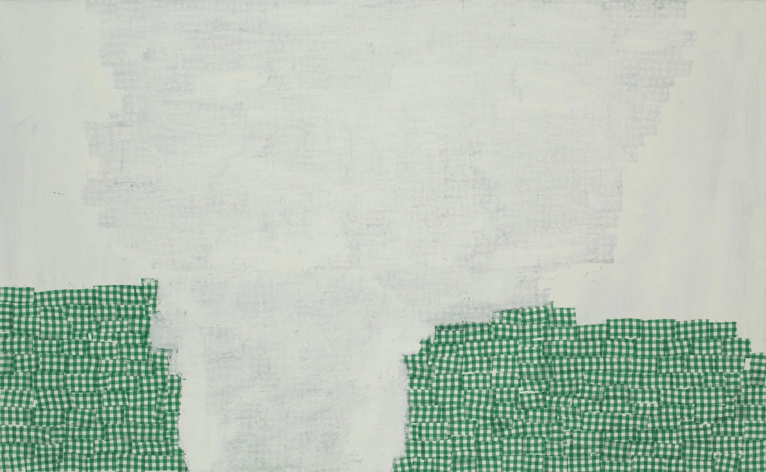
By the end of that decade and armed, I think, with both confidence and a sense of freedom, Price’s practice became even more experimental. While on a residency at Denver’s RedLine Center for Contemporary Art, he started to use pre-printed fabrics as his exclusive medium, first in works on paper and then on large canvases. Using strips of cast-off stripes and gingham, Price dug deeper into his predilections for materiality, pattern, and form.
Channeling the Pattern and Decoration movement of the 1970s, these cut fabric works, adhered with gel medium, are the literal definition of collage, and critique yet another hallmark of modern art while bringing his practice further into the realm of camp. The particular fabrics he employed, many gleaned from his sister’s sewing studio, are unmistakably part of the American cultural idiom, redolent of sun dresses, table cloths, bric-a-brac, and other schmatta. Dorothy wore it exclusively in the film version of The Wizard of Oz. (Gingham, in particular, is notable for the way its cross-grid “falls” in skirts and dresses to form a lively, overlapping pattern). These works – again – critique modernist tropes (the grid, flatness, surface, personal touch) while also embodying the thorny topics of conventionality, domesticity and “home” (and, by extension, the artist’s upbringing). In toto, the fabric works go a long way in knocking high abstraction off its pedestal, while also revering it, something that could be said of his entire practice at this point.
Price grew tired of large-scale painting, a common predicament for painters at some point in their careers. Beginning in 2010, he began three series of paintings bound by their small scale; the first were done on 8 x 10 and 16 x 20 inch, pre-stretched canvases, before he settled into a 9 x 12 inch format.
Over the next few years he realized roughly 500 of these small works, an amazing burst of creative and physical energy, particularly considering he also completed major large-scale works at this time.16 These formats allowed him to work quickly and on several different ideas at once, without the burden of unnecessary decision-making about size and, to some degree, the rules of math that often organized his canvases. The 9 x 12 series even has its own taxonomy, 12 sub-groups (determined by the artist) with their own inner logic, including “bent cube” and “double diagonal” as well as more open classifications like “text” and “field.”
Over the past 15 years, Price has been committed to other bodies or work that allowed him to extend his ideas into the third dimension. These include humble blocks of wood adorned with his familiar lexicon of patterns, techniques, and materials (including fabric), and more eccentrically shaped wood objects, conceived for the wall, painted with his distinct palette.
There are also painted paper sculptures, cleverly worked with Price-ian marks. He has also experimented with ceramic, in addition to his continual return to drawings, collages, and other works on paper.
The newest works in the exhibition extend his range of systems, materials, colors, scales, and formats, continuing to dirty-up any purity that happens to emerge. He has introduced waveform patterns in several and another group, called Geology, he explores things like strata, gravity, surface, and time in what appears to be his first quasi-landscapes. His use of Photoshop to create anamorphic distortions of traditional pattern designs from India and Egypt bring him further into the realm of topology, another type of math that studies the properties of shapes and spaces that are preserved under continuous deformation, like stretching or bending.
Variability also continues to be a key principle for Price; a large diptych can be installed in one of four ways; it spans nearly 12 feet when installed in its longest arrangement (the fabric works Cliffs and Valley/Mound are also variable). Finally, in other recent works he’s lightened his palette, I think significantly, though it seems anathema to raise the possibility of any “late style.”
A humanist at heart, Price’s work possesses a Kantian “purposefulness” that goes beyond traditional beauty and aesthetics. It is fundamentally informed by mathematics, geology, music, and the physical and social sciences.
When examined as a whole, his art presents various schema—by definition, “representations of plans, theories, and concepts that are common to all members of a class.”17 Schema can be emergent, but also syllogistic, meaning they demonstrate different levels of argument to draw ideas from a premise. Perhaps his neuro-divergence (a source of much educational and social difficulties) plays a part here. Regardless, he has leaned into it, making the concept of difference a fundamental part of his studio practice.
At the end of the day, Price is a geometric abstractionist and, like some Trump-era neo-renaissance master, he’s fixated on the square, only now sliced, resized, anamorphized, cubed, and all these combined. Squares were the basis of his early grid paper works, where it all began.
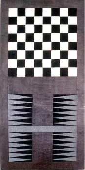
Several of Price’s images—3-D cubes, jiggly diamonds, gingham—invoke chessboards, a type of grid associated with the fine arts over many centuries and cultures, both as subject and object (after 1923, the arch-dadaist Marcel Duchamp mostly gave up art for chess). Painting and chess possess several uncanny relationships—things like figure/ground, movement, but also strategy, thought, reflection, chance, and the hyperbolic goal of ultimate achievement. In the end, I imagine Bruce Price being a frustrated chess player, impatient with all its fixed rules and movement patterns, preferring to give the pieces more freedom, never having things stay the same.
Dean Sobel is a professor of the practice of art history and museum studies at the University of Denver. Sobel was founding Director of the Clyfford Still Museum, Denver, Director/Chief Curator at the Aspen Art Museum, and Chief Curator/ Curator of Contemporary Art at the Milwaukee Art Museum. He has organized over 80 thematic and one-artist exhibitions, including retrospectives of Vito Acconci and Jackie Winsor and projects with Louise Bourgeois, Ed Ruscha, Robert Mangold, Cindy Sherman, Felix Gonzalez-Torres, Stan Douglas, Thomas Demand, and Olafur Eliasson.
Notes
1. John Rajchman, “Abstraction,” in Constructions, Cambridge, MA: The MIT Press, 1998, p. 55.
2. Amy Sillman, “AbEx and Disco Balls,” Artforum, Summer 2011, p. 322.
3. The Whitney Museum’s 1993 Biennial Exhibition remains the defining event for this assertion. Colloquially dubbed “the political biennial,” there were no objectively “abstract” works in the exhibition, other than Suzanne McClennan’s wan abstractions and Sue Williams’ splatters and daubs, used to moor her images of sexual violence to the painterly violence valorized in expressionistic abstracionism (De Kooning and Hermann Nitsch come to mind). My reference to 1975 stems from the editors’ statement in Artforum’s September 1975 volume dubbed on the cover as “Special Painter’s Edition,” in which they declared that painting at that time was “dead.” Finally, it’s worth remembering that, in the nineteenth century, the invention of the film camera first prompted the slogan “the end of painting.”
4. For the Pictures generation, see Douglas Crimp, “Pictures,” October, no 8, Spring 1979,
pp. 75–88 (revised version of his 1977 essay in the “Pictures” exhibition brochure, Artists Space, NY).
The most comprehensive survey is The Pictures Generation, 1974–1984, (New York and New Havenand London: The Metropolitan Museum of Art and Yale University Art Museum, 2009).
For abstraction painting, as it was surveyed at the beginning of Price’s career, see Kerry Brougher, The Image of Abstraction, (Los Angeles: The Museum of Contemporary Art, 1988.).
5. Rajchman, p. 61.
6. Linking things like queerness and abstraction necessitates a consideration of “queer figuration.” Though outside of the scope of this text, historical queer art has been aligned mostly with representation, particularly a distinctly sexualized realism, seen in, say, Paul Cadmus, George Platt-Lynes, and even Tom of Finland.
38
7. Lynne Cook took the Fondation Beyeler to task for omitting artists from the Pattern and Decoration movement in the survey Ornament and Abstraction: The Dialogue between
Non-Western, Modern and Contemporary Art,” in “Pattern Recognition,” Artforum, October 2021, pp. 132ff.
8. See David J. Getsy, Queer Behavior: Scott Burton and Performance Art, (Chicago: University of Chicago Press, 2022).
9. Conversation with the artist, spring 2025
10. Experimental studies have traditionally been part of RMCAD’s mission and curriculum; upper-level courses with the title Experiential Studies still exist at RMCAD as of 2025. For further reading on Drop City, see West of Center: Art and the Counterculture Experiment in America, 1965–1977 (Denver: MCA Denver, 2011) and Jason A. Hoelscher, Art as Information Ecology: Artworks, Artworlds, and Complex Systems Aesthetics (Durham and London: Duke University Press, 2021), pp. 178–85.
11. See James Hambridge, The Elements of Dynamic Symmetry (New Haven: Yale University Press, 1959, 2nd reprint).
12. Rajchman, p. 56. Emergent theory and syn-ergy theory both explore how complex systems arise from the interaction of simpler parts, but they emphasize different aspects. Emergence focuses on the novel properties or behaviors that arise from the interaction of components, which are different from the properties of the individual parts. Synergy, on the other hand, emphasizes the additive or multiplicative effect of combined forces or elements, where the whole is greater than the sum of its parts. In essence, emergence is about the what – the new characteristics that appear – while syner-gy is about the how – the increased effective-ness or power resulting from combination.
See also, John Protevi, “Deleuze, Guattari, and Emergence,” Paragraph (July 2006, vol. 29, no, 2), pp. 19–39.
Miriam Schapiro, Presentation, 1982.
90 × 144 in.
Milwaukee Art Museum,
Gift of Mr. and Mrs. Alan Koppel.
Photo: Dedra Walls.
© The Estate of Miriam Schapiro/ Artists Rights Society (ARS), New York
Scott Burton, Two-Part Chair, 1983/86. Lake Superior green granite.
40 x 23 x 36 in. Installation view, The Art Institute of Chicago.
© 2014 Estate of Scott Burton/Artists Rights Society (ARS), New York
Sherrie Levine,
Lead Checks and Chevron, 1988. Casein on lead. 40 x 20 in.
The Broad, Los Angeles.
Piet Mondrian, Lozenge Composition with Yellow, Black, Blue, Red, and Gray, 1921.
Oil on canvas. 23 ⁵⁄⁸ x 23 ⁵⁄⁸ in.
The Art Institute of Chicago,
Gift of Edgar Kaufmann, Jr.
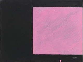
Mary Heilmann, Pink and Black is Coming Back, 1983. Oil on canvas. 16 x 20 in.
Courtesy Hauser & Wirth, NY.
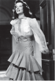
Katharine Hepburn wearing gingham in
The Philadelphia Story, 1940.
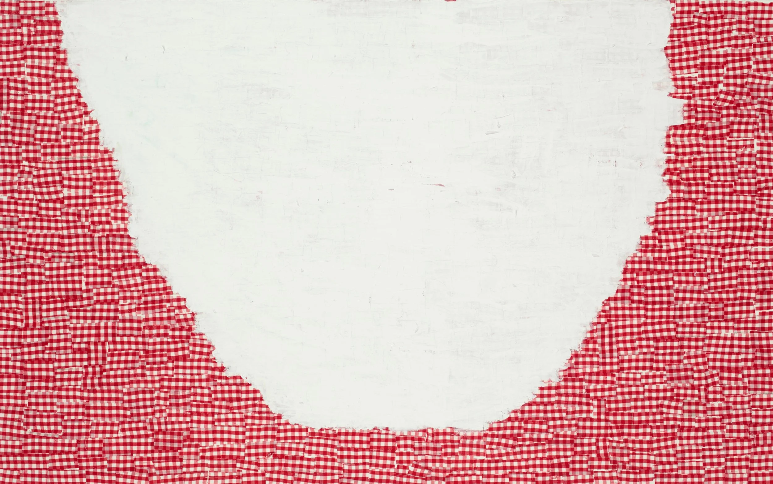
Cliffs and Valley/Mound